


Bruce Tognazzini’s 5 Principles of Human Interface Objects have been developed over decades of working with major brand products . Bruce, who is lovingly known as Tog, worked at Apple for 14 years as their Human Interface Evangelist and now is a principal at Nielson and Norman group where he has worked for the past 20+ years. He wears suspenders to support the weight of his 56 patents in radar tech, aviation, eye tracking, GPS, and others.
Tognazzini’s 1st principle states that objects should be seen, heard, felt, or perceived like screens, alerts, or VR haptic suits.
Objects should be operated in a standard way like keypads, joysticks or light switches.
Objects should have standard resulting behaviors like ringtones, play buttons, or brightness adjusters.
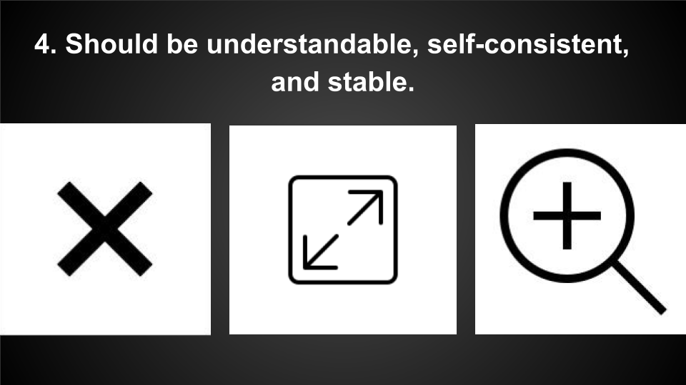
Objects should be understandable, self-consistent and stable like these icons for close program, full screen, or zoom-in features.
We should use new objects when people need to interact with it differently, or if it results in a different behavior.
For a quick example, we might use a shredder icon instead of a trash can if the feature immediately deleted files.

The Playstation controller has endured 25 years of road tested scrutiny and multiple interface upgrades. The first upgrade to the UI was joysticks, then wireless control, haptic feedback, mic/speakers, and then touchpad. With the unreleased Playstation 5 controller, we will have motion sensors, adaptive triggering, and changeable joysticks. These innovations empower the human interface objects to be seen, heard, felt and understood.

This is the Sphero educational Robot. In the middle image, we see a UI with a joystick driving feature. It’s paired with an adjuster for speed, sound, and color. Sphero is good for sighted people, but for people with visual impairments who use screen readers, there is a struggle with the operation of a joystick control, or code block programming; seen on the right. Based on Tog’s principles, a new interface object would be needed to empower new results and behaviors.

Fortunately, researchers at University of Washington saw these challenges and developed the Blocks4All prototype to remove three barriers of block coding for people with visual impairments. The barriers they removed are the drag and drop challenge, the awareness of coding structure, and the order of code operations. Regarding Bruce’s Principles, these solutions empower the perception and understanding of a consistent coding system.
David will take over from here to share the remaining good and bad examples.


Since 1981 when Xerox introduced the hamburger menu, it has allowed users to access their preferred content directly, instead of everything at once. With only a few clicks, billions of users can quickly get to where they are going, without getting stuck searching though every link or block of text.
With Uber, the main goal of this app is to order a car. For this reason the majority of the screen’s real estate is dedicated to booking a vehicle. Uber uses a hamburger menu in a passive way by hiding content that is not crucial to the primary goal. For things like records of past trips, receipts, and payment settings, users will have to click the hamburger menu to access these non essential buttons.The hamburger menu obeys the principle that objects should have resulting standard behaviors. It is also good example of consistency, visibility, and stability in understanding how it works. Either by providing crucial navigation or getting out of the users way.
And now for the Bad Examples.

We found a study that showed how screen readers cannot detect a chat or invite feature that is nested behind the menu. If Siri could scan the menu source code, she could say “Click Participants to Invite people to this meeting.” Zoom could also put the Invite Link and the Chat feature on the dashboards so screen readers can support people with visual impairments.

This is the food delivery service I use in long beach, however their site's primary navigation has one huge issue. This navigation is challenging for customers due to low color contrast and tricky to understand their delivery zone. A customer must know what zone their order is coming from as well as the zone the order is going to. That is why the primary navigation fails the principle that objects can be seen, heard, felt, or otherwise perceived.


Our solution is a clear primary navigation, where delivery zones are managed internally on the administrative end. Customers should only be offered delivery options from restaurants based on their delivery zip code, much like how GrubHub or DoorDash operates. This updated solution follows the principle that objects should be understandable, self-consistent, and stable

I always wonder, why can't I login with the email address associated with my airline account? Airline logins have created a new type of object unnecessarily; while this is a new convention it is not a unique experience. If I can log into my Amazon or Bank account with my email address, I feel like I should be allowed to do the same with the airlines. I believe these logins have failed the principle that objects should result in standard behaviors.

Our solution allows customers to sign in to their airline account with their email address and password, and for additional security purposes, we would implement 2-factor authentication. This login would reflect traditional conventions by following the principle that objects should have a standard resulting behavior.

Thank you all for being with us to learn about Tog’s 5 Human Interface principles and our next slide provides sources and the link to our preparation notes.
Sources
Icons by the Noun Project
https://wdww.good.is/articles/using-the-noun-project-s-iconic-design-tools-for-social-change
Bruce Tognazzini Blog https://asktog.com/atc/principles-of-interaction-design/
Sphero accessibility research https://par.nsf.gov/servlets/purl/10063855
Sphero accessibility https://wiki.fluidproject.org/display/C2LC/Examining+Sphero+for+Accessibility
Blocks4All paper https://.nsf.gov/servlets/purl/10063855
Blocks4All solutions https://www.youtube.com/watch?v=8HBYrarjSRo
Zoom Accessibility https://www.smashingmagazine.com/2020/06/accessible-video-conferencing-tools/
Zoom accessibility tips article https://mosen.org/zoom/
Hamburger Icon https://www.invisionapp.com/inside-design/an-oral-history-of-the-hamburger-icon-from-the-people-who-were-there/
Full list of sources and preparation noteshttps://docs.google.com/document/d/1p26yRDsSxtPnI8IartThTB2xCG2T2v9JVWG4O68kXI0/edit?usp=sharing